WEEK TWELVE - NEW STEPS

When designers are the vehicle, not the mark maker.

Another student from our Master’s program, Kim McNeil, asked me to collaborate with her to bring a Canadian perspective into the reading she has been doing on the residential school system in Canada.

Between 1881 and 1996, Canada’s residential school system saw more than 150,000 Indigenous children forcibly removed from their homes (some as young as three years old) and taken to government-funded boarding schools to assimilate them into Christian, Canadian society. Through Survivor’s accounts, we know physical and sexual abuse were rampant at the schools, with students beaten and starved for speaking their native languages.

Kim chose the Survivors’ Flag as our inspiration piece, which was commissioned by the National Centre for Truth and Reconciliation and designed by Vincent Design in collaboration with residential school Survivors. Each detail was carefully selected & is explained here: https://nctr.ca/exhibits/survivors-flag/

Note on language:
The word Survivor is capitalized intentionally out of respect.
The term residential school is not capitalized to strip all importance from it.


Reckoning.

When approaching work that includes Indigenous perspectives, culture or work, there should first be a reckoning. Through what lens am I approaching this work? Is there risk of doing harm? Am I informed? Do I need to add my voice? Has my ego been left at the door?

With this topic, my voice as a designer is not needed.

However, my skills can help execute a greater concept by giving a platform and new application to this thoughtful, and well-considered symbolic flag.

Kim and I had great conversations on how the role of graphic designer can be a vehicle to present and package a greater concept, without leaving our own mark.

The Survivors’ flag is often only seen and understood by those who have already opted-in to learn more about the horrors of the residential school system, and can unfortunately be subject to defacement or politicization.

However, what if we applied the symbol in ways that confronts and connects to every person in Canada, not just those who actively looking?

It is illegal to deface Canadian currency and passports, so in this application the flag is protected, valued and honoured. But with these new applications, the context and perceptions can be read differently with each object. You must be informed of the history and what these items may represent while marrying a symbol of hope and resilience to them.

Canada Post stamps that feature Indigenous elders.

For Kim’s portion of the collaboration, she chose to use a set of postage stamps and a passport as the vehicle to showcase the flag. Many Indigenous people whose traditional land goes across the US and Canadian border do not need a passport to move freely between these spaces. A passport, for them, would be unnecessary and meaningless. This passport will mostly be in the hands of settlers.

I chose the $20 Canadian note is it is the most popular/circulated note by far. It’s also the only note which features the Queen’s face on the front, and currently there are no indigenous people represented on paper currency.

For the front I just tried to honour the flag design and colours as much as possible, while working within the frame of what goes on a bank note.

Finding balance.

On the back of bank notes, there is always more context linking to the face on the front of the note. I thought of what could speak to the flag, but could perhaps celebrate the history and culture of all Indigenous people across Canada.

Often when talking about the residential school system, there is a risk of re-traumatizing Survivors of these institutions, and the communities that are still suffering the effects of generational trauma. I looked for a way to bring a greater context, as per the bank note format, but also to balance with lightness or triumph. I chose to include a piece by Indigenous artist Jordan Bennett, as his work is inspired by Mi’kmaq and Beothuk iconography such as petroglyphs, basket weaving and quillwork.

The Jordan Bennett Collection Pendleton Blanket.

Petroglyphs, carvings and paintings found across Canada and are often more than 1,000 years old. I liked the way it acknowledges the oldest representations of culture in Canada, through a current artist, and speaks to the resilience of indigenous culture, that the Survivors flag also represents.

The selected piece from Bennett was designed to be applied to a Pendleton blanket as an official collaboration and act of reclamation. Wool blankets such as these were one of the first forms of currency between settlers and Indigenous people, being used since 1670, and have a long and complex history. The Points of the Hudson’s Bay blanket accurately denoted its value.

I like the way that Bennett’s piece speaks to the meaning of currency under modern capitalism, what it used to be, and perhaps what it could be in the future.

Here is a bit about Bennett’s work: https://canadianart.ca/sponsored/the-jordan-bennett-collection-honouring-tradition-celebrating-the-contemporary/

Petroglyphs: https://www.thecanadianencyclopedia.ca/en/article/pictographs-and-petroglyphs

Point blankets: https://www.thecanadianencyclopedia.ca/en/article/hudson-s-bay-point-blanket

Unsettling Settler Possession: https://visualartsnews.ca/2020/10/unsettling-settler-possession/


My re-designed of the $20 Canadian bill, which is used as the vehicle to present the Survivors Flag, and Jordan Bennett’s work.

Kim McNeil’s re-designed Canadian passport, and national stamp.


Brief Three Reflections

With this final brief, I found I often thought of what my role and voice is a designer. I have the power to inform and shape the output of design pieces but when should I lay off the accelerator and take the back seat, or the bus.

I think an ego-check is warranted depending on the piece of work and what the end goal or vision is. With week 12’s output, a designer should be glad not to put their name onto that piece at all, and instead be proud to have leveraged a platform for others.

What does my voice bring, and how should I use it.

I also found myself inspired by looking to the past. When researching the Beat Generation movement, it opened up so many other avenues to explore. The underground press, DIY sharing of information and art, how artists communicated.

Being informed is crucial to output meaningful work, and information can spark so many more ideas.

I think it’s also important not to reinvent the wheel. Theres always something from the past, or present, that we can draw from.


Lectures and Readings

In Sam Winston’s talk he said something that really interested me, as it’s something I ponder quite often.

The future of design is inherently tied to the attention of the economy, and is inherently tied to technology.

I think the way we consume social media, articles, news, video has altered our attention spans and is caught in a bit of a viscous cycle. META noticed we weren’t completing the view on 30 second videos, so it changed the format to 15 second stories. Then we started skipping through the stories after a few seconds. So now snippits of video only 1 second long are being mashed up it to “mini VLOGs'“ on Instagram Reels.

I wonder to what end point, or to what will give first.

Personally, I think there’s been too much change, too quickly, and too much is informed by what makes advertisers money.

I hope that the future of design looks through an anti-capitalist lens, and so we can stop feeding the beast that it quite literally altering our brains.


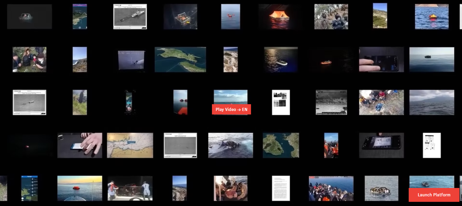
Forensic Architecture

To see an examination of this depth is quite incredible. There’s so much to absorb. Especially with it being a non-linear, you can take so many different paths when exploring this data.

I was surprised that each case was so in-depth and multi-layered, with timelines, high quality video production, animation, mapping, topography. So much has been considered it almost feels impossible.

WEEK ELEVEN - TRENDS & ENVIRONMENTS

When I first read this week’s brief my mind immediately went to our biggest recent national news story - the Papal visit in Canada. But after pulling some headlines and accompanying images from different outlets, I stopped in my tracks. I’m not sure what learning outcome I would get out of this. I could skip directly to the end point and nothing will have surprised me. So - I pivoted. It’s time for a bit of joy and lightness instead.


How branding adapts to location and audience

When considering a new topic to research for this workshop challenge, I understood that I needed to find a branding and marketing icon that was at once ubiquitous and diverse — they had to be big enough for there to be plenty of material to dig into, while also providing uniques vectors of consumption, depending on where it was being marketed.

I chose Snoopy, of Peanuts fame, as he’s a character that has broad, universal appeal but is also approached in very different ways, depending on where in the world you encounter him. He (along with his friend Woodstock) is the breakout star of Peanuts, becoming an icon independent of the Peanuts gang.

That, I just think he’s neat.


Joe Cool

“’For a while, I received a couple of letters from somebody that said, ‘Don’t use the dog so much. Get back to the little kids.’ I never pay attention to letters like that.”

-Charles Schultz in conversation with Rick Marshall for NEMO: The Classic Comics Library, January 1992 (from The Complete Peanuts: Volume 1).

First appearing in the third Peanuts daily comic strip in 1950, Charlie Brown’s beagle Snoopy has undergone an apotheosis matched by only a select few — like his fellow funny animal luminaries Mickey, Garfield and Hello Kitty, Snoopy is an international icon, transcending borders and language. But where does this universal appeal come from, and how does it vary in different parts of the world? In this discussion, we will be looking at Snoopy’s appeal, and the difference between how he is marketed in Japan and the majority English-speaking countries as represented by the United Kingdom, England and Canada.

What is the appeal of Snoopy? What is it that makes this cartoon dog so universally beloved? In a large part this popularity is owed to Snoopy’s simplicity. Outside of his comic-strip thought bubbles, he doesn’t speak- which means that he can cross any language barrier. In addition, in a more philosophical sense, this marks him as a character that is particularly “safe”— he doesn’t speak, and therefore can never say the wrong thing, unlike other more vocal and controversial characters with a similar global reach like Bart Simpson.

In addition, his design is utterly artful in its simplicity — a black and white dog, depicted in a few spare, rough-textured lines, easy enough for any child to draw while at the same time sophisticated enough to convey enormous emotion with the slightest quirk of an eyebrow, pupil, or facial expressions. Snoopy’s design has withstood the test of time, in that he is as charming today as he was in his introduction, and represents an almost Steve McQueen-esque timeless cool — unlike the shuddering “cringe” that accompanies other more modern children’s characters such as the Minions like a psychic stink.

All of which is to say: Snoopy is big business, one of the most marketed characters in history. What is interesting, however, is how that marketing is pursued. In Japan, Snoopy merchandise is handled by the merchandising juggernaut Sanrio, of Hello Kitty fame, as well as an enormous stable of lesser characters, from the second-tier characters Keroppy and Badtz-Maru to the odd and obscure like the crocodile Big Challenges and the good-times elephant ALFREDALOHA. There, Snoopy is marketed with the same gusto we’d come to expect from Sanrio — he’s not merely a character, but a lifestyle on the level we in the West could only compare to Disney’s overwhelming market dominance.

In Japan, there exist Snoopy theme parks, Snoopy cafes, Snoopy hotels, museums, even tea shops. Snoopy, in Sanrio’s hands, goes beyond the realm of mere merchandise and into the very fabric of popular culture and commerce.

But where is that enthusiasm in Snoopy’s home, America (and by extension the rest of the English-speaking, American pop-culture fed world)? One could argue that Snoopy’s reach in Japan is impossible in the West — as that is simply not how things are done here. Even Disney, the undisputed king of children’s corporate media, doesn’t have the kind of grasp on English-speaking pop culture and its enmeshment with the rest of society that is considered ordinary business in Japan. Instead, Snoopy functions as an activation, rather than a lifestyle.

Here, Snoopy’s merchandising is less monolithic but instead more diversified in its reach. One can expect Snoopy Hallmark cards in the nearest pharmacy, but his reach extends from high street retailers like Zara, H&M and Gap to some of the more rarefied luxury brands such as Coach and even an extended collaboration with watchmaker Omega. Even NASA is involved, with their ”Silver Snoopy Award”. Regardless of scale or product, Snoopy’s universality allows him to fit in seamlessly

Looking at the differences between how Snoopy is marketed and used in Japan and the English-speaking world present interesting contrasts. Japan is often seen as a semi-sealed system, generating its own entertainment and methods of doing things, we see the opposite in the English-speaking world — popular culture being exchanged at a furious rate, leading to a certain amount of homogenization between these cultures.

Regardless of these differences, however, we can all agree — Schultz made the right choice, ignoring those letters.


Snoopy theme park and museum in Tokyo, a look from a 2016 Gucci fashion show, and Snoopy in a 2021 collection from Danish label Soulland.

Imada, K., 2022. 7 best snoopy attractions in Japan. Time Out Tokyo. Available at: https://www.timeout.com/tokyo/things-to-do/best-snoopy-attractions-in-japan [Accessed August 21, 2022].

Litterst, R., 2022. You’re a fashion icon, Charlie Brown. The Hustle. Available at: https://thehustle.co/02172022-charlie-brown-fashion/ [Accessed August 21, 2022].

Mars, K., 2015. Silver snoopy award. NASA. Available at: https://www.nasa.gov/directorates/heo/sfa/aac/silver-snoopy-award [Accessed August 21, 2022].

Satran, R., 2022. Selling snoopy: How peanuts fashion became big business. The Wall Street Journal. Available at: https://www.wsj.com/articles/snoopy-peanuts-fashion-became-big-business-11644869170 [Accessed August 21, 2022].

Schulz, C.M. & Keillor, G., 2007. The complete peanuts, Edinburgh: Canongate books.

Watterson, B., 2007. The grief that made ‘peanuts’ good. The Wall Street Journal. Available at: https://www.wsj.com/articles/SB119214690326956694 [Accessed August 21, 2022].


Lecture and Readings

Ah, semiotics, symbolism and Barthes, a familiar feeling of frustration washes over me, and takes me right back to my undergrad..
The theory and symbolism behind a message, key points and thoughts:
Message sent does not necessarily mean message received.
It was interesting to consider how message is understood, vs the original intent.

I do struggle with thinking conceptually when exploring these ideas, and tend to look for examples. Signs consist of a signifier (a word, an image, a sound, and so on) and its meaning – the signified. I found a basic image that helped me understand this relationship, but honestly, Barthes just isn’t my kinda guy.

As you can see in the diagram, the second-order signification — the sign itself being used as a signifier, which adds a second layer of meaning — is what Barthes calls a myth.


For parts 2 & 3 of the lectures, and the reading of Heller’s Design Literacy and found a lot of interesting perspectives on symbolism, message, and being referential in your output. I’m still mulling on all the examples brought up in the olympic designs.

WEEK TEN - TYPE AND PAGE

Final output


I was drawn to explore a poem from the central, and arguably the most prolific poet of the Beat Generation — Allen Ginsberg. I chose Wichita Vortex Sutra (1966) as I have seen the accompanying music piece performed live, by Beat Generation collaborator, composer and pianist, Philip Glass.

In its live rendition, Glass plays the stunning accompanying piano piece while a recording of Ginsberg’s reading plays powerfully through speaker. You can hear the pacing and emphasis he gives to certain words, pauses, phrases, and sometime words are hurriedly slurred together with powerful intent.

As a designer, it opens up interesting points to consider — how can I convey movement and flow that shepherds the reader through the piece in the way the author intends?

Philip Glass and Allen Ginsberg, Turin, 1992 – photo: Guido Harari

The Beat Poets

An excerpt from The Beat Poets, Poetry Foundation.

In the 1940s and 50s, a new generation of poets rebelled against the conventions of mainstream American life and writing. They became known as the Beat Poets–a name that evokes weariness, down-and-outness, the beat under a piece of music, and beatific spirituality (...)

Beat poets sought to write in an authentic, unfettered style. “First thought, best thought” was how central Beat poet Allen Ginsberg described their method of spontaneous writing.

Available at: https://www.poetryfoundation.org/collections/147552/an-introduction-to-the-beat-poets

When approaching the design, I kept the spirit of the Beat Generation as a guiding principle. Visually, can I make it look spontaneous with layout, type, and colour? They challenged mainstream culture and conventional writing styles — can I challenge the standards of print?

I also looked to how the Beat Poets wrote and distributed their works during this period of social change and experimentation. They took an anti-capitalist approach where the accessibility and sharing of ideas was critical. Wichita Vortex Sutra was first printed, in full, in the Village Voice New York paper.

Incredibly, Wichita Vortex Sutra originated as a voice recording that Ginsberg made with an tape recorder as he traveled across the mid-west. He composed it off the top of his head as he spoke into the device.

“These lines in ‘Wichita’ are arranged according to their organic time-spacing as per the mind’s coming up with the phrases and the mouth pronouncing them. With pauses maybe of a minute or two minutes between each line as I’m formulating it in my mind and the recording ...

I was in the back of a bus, talking to myself, except with a tape recorder. Every time I said something interesting to myself I put it on tape.”

Quote source: https://www.worthpoint.com/worthopedia/1966-free-press-allen-ginsberg-1795090800

The depth of this piece is outstanding. Spontaneous thought, spoken, as the mind thinks, and the mouth speaks. Inspired, in the moment, looking out of a bus window in Kansas. Now, typed as a written piece, carefully arranged to mirror the natural pace and flow of the recording. And finally, accompanied by an original piano composition that flows, builds and relaxes with the spoken words.


Leading | Stress | Pace | Colour | Mark Making | Flow | Font | Era

I imagined Ginsberg’s workspace as a too-small desk, with an uncomfortable chair. He sits hunched over a clunky typewriter, over-caffeinated, furiously hitting the keys as his mind bubbles over with anger at the US government, apathy, war, poverty and classism. All the papers on his desk have coffee rings, cigarette ash, and scribblings. Some of the words are typed over, perhaps a mistake, or intentionally for emphasis.

Although the poem can be soft and tender, his voice soothing and Glass’s playing heartfelt — the change Ginsberg called for was bold. He dared to address capitalism as a disease, and war as a cancer. This poem is a call to action, a wail, a cry for others to join him — to join his resistance.

The leading helps organize the reader through the work, showing them which thoughts continue forward quickly, and when your mind can take a brief rest.

As the full poem is many pages, I chose a natural ending point for the excerpt in my visual expression. In the future, I would love to explore how I could put together the full poem into a book, and what that could look like through the lens and guidance of the Beat Generation.

I also pulled inspiration from underground press in the 60’s.

https://www.theguardian.com/media/gallery/2017/sep/23/covering-the-counterculture-the-60s-underground-press-in-pictures

I don’t think the audience knows how to take Ginsberg’s sincerity…


Lecture and Readings

Type, it’s history, fonts, and the different applications is a bit of a blind spot for me. My education in fine arts and printmaking, always steered me into the art print side of print production.

This week’s lecture helped fill in some of the gaps in my knowledge, not just in type, but of the analog days of design, and more context to pull from in my graphic design practice

While I have taste and eye for how type works in a composition, and an aesthetic point of view, I took this week as a chance to dig further into the history of published media, particularly alongside my research on the Beat Generation.

It’s interesting to me, how art and socio-political movements had an aesthetic, often informed by the production means they had access.

Excerpts from readings:


Cooper Black is an iconic font, and a favourite of mine (not that I get to use it much). This video was a fascinating look at production, industry, and the practicality of how this font came to be a staple:

I also looked further into accessibility, classism, and anti-queerness in fonts, but I think I could dedicate an entire semester’s research into those themes. Another video that helped inform me on the applications and versatility of font design was Times New Roman, below:

WEEK NINE - MESSAGE DELIVERED

Final Output


Breezy: adj.

1. The people of Halifax are known for being easy going, friendly, and approachable.

2. Nova Scotia’s rugged Atlantic coastline is known for its unpredictable winds.

3. There can be a measure of apathy or lack of willingness to engage in social issues, which Halifax is not without.

(Left) Africville- an African-Nova Scotian settlement that was destroyed by the city government in the 1960s in the name of “urban renewal”.

(Centre) Fishing equipment and buildings are weathered beyond their years by the constant lashing of the wind.

(Right) Reminders of a colonialist history- many outdated and incorrect terms for Aboriginal peoples remain in use to this day. The largest mall in the province still carries the name “Mic Mac Mall”.

After chatting through some ideas on output with Joe, his suggestion of an audio tour really jumped out at me. I love the idea of hearing voices from different neighbourhoods speak to the history and cultural importance of their own communities.


BREEZY — AN AUDIO TOUR OF THE CITY OF HALIFAX

For both the long-term Haligonian to the seasonal tourist, BREEZY has something to offer to everyone. Whether its learning more about the neighborhood you live in or learning about a new one, an app-based audio tour could inform listens about:

Historic Africville - the triumphs of community and betrayal by the city

Cherrybrook - the talented musicians that live there

The site of Halifax’s first queer space - Thee Klub on Barrington St.

The Halifax Explosion - the scars that remain from the historic disaster

Titanic graveyard - the final resting place of so many from the famed wreck

Uniac Square - the origin of so many influential and important people, community activists, musicians, artists and more

NSCAD - a watershed institution in the development of the arts in Canada

The Mi’kmaw Native Friendship Centre - a place for the Mi’kmaw community to preserve their culture and plot a course forward for the future

The historical figures the streets are named after - the good, bad and ugly

An interactive audio tour of the Halifax, from the people that are part of its living history.

I envision this as an app, with complimenting physical plaques and markers across the city. This allows for organic discovery as people walk these communities, and are confronted with a better understanding of each unique community.

The plaques invite pedestrians to scan QR codes that bring up a web page with the audio related to the neighbourhood, and an invitation to download the full app.


Lecture & Readings

How the medium changes the message.
I loved the concept of The Solar Annual Report as it’s fun, bold, a bit cheeky, speaks to their industry, clear and concise visually, with a bit of socio-political commentary. Annual Reports can be extremely dry content to sift through if done incorrectly, and not only does this bring sun and light, literally, to it — I think the message pivots away from the findings of the report, to what can be in the future.
You can’t read this report at your desk, or after work hours when the sun is down. It speaks to you, and directs you to go outside, to enjoy the sun, and perhaps mix your office day up by moving outside. I don’t think a report has ever hade me get up out of my chair before, let alone gave me an opportunity to sit in the grass for 15 minutes.

Wit in Design

This is something I strive for with varying degrees of success in my personal practice, and something I often fail in professionally. In my professional design work, I find there’s often no room for an extra layer of commentary, thought, or playfulness, as graphic design can be quite strict in it’s priority of messaging

Why is it that I find it easier to play with wit in fine art, than I do in practical design. In the future I would like to explore ad and marketing campaigns that have managed to take a usually serious and dry brand, and injected humour.

Flowerworks

The concept of wit in design reminded me of theme of last year’s Met Ball Gala, and corresponding display - Camp.

A lot of attendees struggled to execute and convey what camp really is. Some took the meaning it a direction that went too far all the way past camp into cartoon or clown territory. And some thought only in the historical context, not considering today’s meaning.

There’s always a risk with wit in design, that it might not translate, miss the mark, or perhaps go overboard.

As with most topics throughout pop culture, Susan Sontag already had a point of view, and an essay.. I love this excerpt from Notes On Camp:

WEEK EIGHT - SKILLS & PROCESS

My current skills: Illustration | Colour theory | Conceptual thought processes | Balance | Flow | Copy

Skills I’d like to develop and acquire: Organization and deadline management | Animation and movement | Research | Photo treatment & direction

Process Model:

Identifying gaps in knowledge, skills and tools is easy for me to make a wish list of, but of those, what are truly necessary? It’s impossible to be an expert, or even fluent, in everything one desires.

What’s reasonable for me to learn? Storytelling is a guiding principle I would always like to keep as steering force, but animation is something to gentle dabble in.

I started prioritizing based on what challenges I face most frequently, and what skills are crucial for me to grow to me desired next step of my practice.

When examining and where these gaps come into play, I found there was a flow to my process.

The process model chart represents all the skills that come into play most often with my projects, even if it’s something I don’t have yet, but often think would be an asset.

Reflections

How do I form ideas, where do I get inspiration, and what holds me back. The lecture on generating ideas allowed me to look at just how amazing our brains ability to generate thoughts, concepts and accessing creativity really is.

I also found it interesting that often what inspires my process is failure. My friend the walrus could be seen as a taxidermy failure, but instead he shines brightly and brings joy to many.

Warhol’s artistic process, or lack there of, inspires me greatly to experiment and be confident in not knowing the end product. Diving in to a project when you don’t have a single idea is sometimes how you get the idea.

Identifying gaps in my work practice is necessary to grow, but also finding the balance in what suits me personally. Making sure I’m focusing on what’s realistic for me to achieve.

I would like to analyze what my strongest skills are as my next step, and take an analytical look and what is it about those strengths that could help shape the next stage in my career. Am I missing something that I can really narrow in on?


Brief Two Reflections

How do I form ideas, where do I get inspiration, and what holds me back. The lecture on generating ideas allowed me to look at just how amazing our brains ability to generate thoughts, concepts and accessing creativity really is.

I also found it interesting that often what inspires my process is failure. My friend the walrus could be seen as a taxidermy failure, but instead he shines brightly and brings joy to many.

Warhol’s artistic process, or lack there of, inspires me greatly to experiment and be confident in not knowing the end product. Diving in to a project when you don’t have a single idea is sometimes how you get the idea.

Identifying gaps in my work practice is necessary to grow, but also finding the balance in what suits me personally. Making sure I’m focusing on what’s realistic for me to achieve.

I would like to analyze what my strongest skills are as my next step, and take an analytical look and what is it about those strengths that could help shape the next stage in my career. Am I missing something that I can really narrow in on?


Lecture and Readings

I was pleasantly surprised to see Brian Eno on the resource list for this week, as I am not only an admirer of his creative thinking, I’m also an admirer of his boldness in music experimentation. No one else looked, acted or sounded like Eno, even when surrounded by his bandmates, he still stood out as extra weird. A quality I hugely admire.


One of the key takeaways I got was to not stay stuck on your island. Talking, collaborating and interacting with other people can bring new ideas, new approaches, or even opportunities for feedback. And perhaps its not talking about work or creativity at all, human connection can help bring you back to earth, and out of your rut.


WEEK SEVEN - RESEARCH & THEORY

Researching research

I found the lecture by Martin Hosken really helped me switch into a more investigative mindset, and armed me with some tools on navigating research, what outcomes to expect, and how to balance information I gather.

I knew I would be suited to choose a subject I had direct access to, or have seen in-person in the past.

I chose an object that has fascinated me and even prompted an excursion just to see it in person — the overstuffed walrus of the Horniman Museum.

Here are the key considerations I identified that will help guide my research on this particular topic.

The Horniman Walrus

In a ten-minute walk from the Forest Hill overground station, you’ll find a stately Victorian-era museum surrounded by lush gardens and filled with some unusual curios. However, there’s one particularly unique specimen on display at the Horniman Museum and Gardens in London.

Hunted in Canada’s Hudson Bay and arriving in England in 1886, the Horniman Walrus sits proudly upon his own fiberglass iceberg at the centre of a large exhibition hall. But what about this specimen deserves such a position of crowning glory? There’s something unusual and unnatural about our friend the walrus, which Boswell (2013) describes as a “time capsule of Victorian-era ideas about natural history”. This one-ton beast has been overstuffed. The wrinkles and folds of hide that we expect to see in walrus have disappeared, and his neck stands tall, protruding up and outward. “When Victorian taxidermists received a strange creature with heavy folds of grooved skin, they thought all those wrinkles needed to be smoothed out” (Meier, 2013).

I visited the “strangely sleek” (Boswell) Horniman Walrus on a trip to London back in 2016, making a special excursion after seeing him highlighted in a program about usual and odd museums in London.

However, seeing him in person was not as laughable or grotesque as I had been led to believe, and in the context of Horniman Natural History Gallery, he seems perfectly at home.

I love everything about this walrus. It’s over-stuffed, inaccurate, rough around all its edges, and tells a story from a time when travel, information sharing, cataloging and photography was rare or inaccurate. It’s a Canadian walrus, on a fake iceberg, in the middle of London.

While it’s perfectly reasonable to expect people who have never encountered a walrus before to be incapable of achieving an accurate representation, it’s also a lesson in failed communication. In an article by The Guardian’s Jim Carroll, he warns modern marketers to take note. “To put it crudely, if you want to stuff a walrus you need both people who know their walruses and people who know their taxidermy” (Carrol, 2016). Perhaps ‘stuffing a walrus’ could be the new turn-of-phrase to confirm teams are communicating effectively.

The Horniman walrus is seemingly beloved by all – but there are some voices calling for a deeper ethical reflection and even to question is he’s worthy of repatriation. Online socio-political journal Dilettante Army invites further exploration – “itʼs crucial to consider the ways in which objects, including those that were once alive, continue the colonial legacy of their forefathers” (Christian, 2016).

Isn’t that beauty of the Horniman Walrus? He sparks everything from a smirk or a giggle to lessons in communication to the greater questions of repatriation and ethics of museum collections. There is truly no more influential walrus than he.

1. Boswell, R., 2013. Stuffed walrus wowed Queen Victoria. Calgary Herald. Available at: https://www.pressreader.com/canada/calgary-herald/20130521/281741266947147.

2. Carroll, J., 2016. Marketers should learn the lessons of the stuffed Horniman WalrusJim. The Guardian. Available at: https://www.theguardian.com/media-network/2016/jun/15/marketers-lessons-stuffed-horniman-walrus [Accessed August 20, 2022].

3. Christian, K., 2018. A wrinkle in time: The horniman walrus and Colonial legacy. Dilettante Army. Available at: https://dilettantearmy.com/articles/a-wrinkle-in-time [Accessed August 20, 2022].

4. Meier, A., 2013. An overstuffed taxidermy walrus comes home. Atlas Obscura. Available at: https://www.atlasobscura.com/articles/horniman-museum-walrus-comes-home [Accessed August 20, 2022].


Lecture and Readings

What is my own method of research? It’s to investigate a subject, while being aware of my own bias, and exploring localized or greater context the subject relates to.

Key considerations when approaching research:
Method/Methodology
Sources: Primary/Secondary
CRAAP Test

One principle that stood out the most to me was on minimizing harm. While you may have good intentions, it’s easy to cause harm and break trust when conducting research or asking people to contribute to your project.

I think of my local Indigenous community. There has been many times when a government branch, organization, reporter, or researcher asks too much of these communities, when there is no relationship to build a foundation on. Why would these communities that have been harmed by people with good intentions before, trust that you wont do the same. If you are asking someone to re-tell a story that’s been told, you could be doing harm by re-traumatizing that person.

I think sometimes research can be so focused on achieving a goal, that they don’t consider that others will never feel the impact of that goal being reached.


When wading through this weeks reading (I say wading as it was very much out of my wheelhouse) I found the visual representation above really helped me organize my approach into an order.

This flow of organizing data I found interesting too, and got me thinking of ways to visualize research at each step.

WEEK SIX - NOTICING THE IGNORED

For my final outcome, I envisioned a collection of oil paints. All the colours are taken from my photographs of the sky outside my window, and curated into a collection of colours that together, represent the living skies of my region.


Looking, Seeing and Capturing

In the middle of February earlier this year, I moved from a tiny apartment in central Halifax to my own home just 20 minutes outside of the city, in Prospect Bay.

Instead of a gas station parking lot full of noise, bright lights, characters and garbage, my view was now uninterrupted. Seeing the sky changing constantly from morning to night, day to day, and season to season was fascinating.

The sky was something I have never observed so fully before.

I looked back though my camera reel from the last 6 months at what I had captured so far, and with this weeks challenge in mind, looked for the most dramatic and broad range of colours the sky could offer.

I started gathering all the ranges of colours and hues I could into a document, with the goal to show the dramatic colours that are revealed without us noticing.

The sky is blue.

The sky is also orange, lilac, lapis, fuchsia, grey, white, yellow, sometimes all at once.

Some of the colours I swatched from the photographs.

When thinking of my final output - I was greatly inspired by Beam Paints, an indigenous owned and operated brand whose colours and hand crafted and thoughtfully packaged using traditional resources like birch and burlap.


Lecture and Readings

Sketchbooks, journaling, observing

I love exploring artists sketchbooks. I found them absolutely fascinating as there’s no guidelines, formats, parameters, no ego. It’s observing, practicing, experimenting, pondering, for no audience but yourself.

Seeing a peek into others creative process can inspire you to try new methods of experimentation.

I often make lists of words - a dynamic list of 20 words can equal 2,000 words of prose. They act as a catalyst to one's thoughts, a provocation of one another, if you like, notes of notes.

Below, Hockney’s sketchbook from: https://etchrlab.com/blogs/news/exploring-sketchbooks

My own sketchbook practice is currently non-existent. It’s a goal for me to start making this a part of my daily routine. I often only se my phone camera to make visual observations, so perhaps it could be an easy step to do a bit of both.

WEEK FIVE - THOUGHTS ON IDEAS

Final output: non-linear thought process


Thought process and lack, there of.

I chose to take a closer look at a subversive figure in the art world as he appears to have an unusual thought-process to making art — Andy Warhol. His methodology was unusual, non-linear, experimental and unapologetic.

His approach was unique for each piece. For some pieces he looked directly at the end vision, keeping on a straight path to the end result and bringing in others to help execute his vision. More often though, his work was informed by experimentation with materials or processes, keeping his vision loose enough to allow for divergences from the standard practices.

He was often unapologetically uninformed and deliberately unaware of the science behind standard practices, but that was made some of his pieces great.

If you had asked an intaglio printmaker what would happen if you poured acid all over a copper plate, they would likely say it would just print as a black wash so why bother exhausting your acid bath. But as Warhol didn’t care to be educated on the history and correct methods of printmaking, he wasn’t confined by those parameters.

Taking the basic principles of acid on copper, knowing it would oxidize, his experimentation becomes an incredible piece of art, conceptually and physically.

“It was just copper paint and you would wonder sometimes why it did turn green and sometimes it didn’t. It would just turn black or something. I don’t know what made it do that.”

- Andy Warhol in Mark Francis, Andy Warhol: 1956-86, Mirror Of His Time, 1996

Andy Warhol, Oxidation Painting (in 12 parts), 1978

What Was Andy Warhol thinking?

https://www.tate.org.uk/art/artists/andy-warhol-2121/what-was-andy-warhol-thinking

In Warhol’s practice, he was completely free. He wasn’t bound to the history of the mediums he touched, he didn’t care to know about the longevity and preservation of his work, and if that became a hindrance, he brought in collaborators and workshop assistants who were more informed and skilled in production.

This was crucial in order to produce art at the high volume he did, and allowed him to focus conceptually on the greater meaning and concept of reproduction and print media.

Warhol’s method of gathering existing materials to print on reminded me of choosing, sourcing and recycling fabric to make a dress from.

I envision him as the pattern-maker.

His non-linear thought process is represented by each piece of the pattern — each working independently, but coming together to make a unique garment. Even when the pattern pieces are made in large quantities, each piece is slightly different. A stitch out of place, a cut slightly off-centre, many hands with different ways of sewing.

My final outcome, a black line drawing that represents this way of thinking.

Andy Warhol, Ladies and Gentlemen Portrait

This series tackled the socio-political issues of cross-dressers. This print features a photo portrait and is transposed by blocks of color, emphasizing the glamorous and eccentric nature of cross-dressing men and women.


Readings and Lectures

There was a lot to unpack with this week’s lecture, so I began with reflecting on my own thought processes. I looked back at my past few creative projects and what approaches I took. I then applied it against the six hats, and found I was only ever wearing 2 or 3 per project. I don’t think I will ever get to a point where putting on all six hats will become natural for me, but I think it’s great to be able to keep this process as a guide, particularly when collaborating with other team members.


Some key questions to ponder: How do we as Designers combine different ways of seeing, thinking, feeling within our design process? How can we create broader context of thinking?


WEEK FOUR - IDENTITY & SELF

A visual expression that conveys me.


20 words that define my values as a designer.
My long list includes a some aspirational words/ideas and some honest ones that I hope to improve upon/overcome: collaborative | curator | scrappy | retro | tuned-in | multimedia | considerate | detail-oriented | emotive | light | playful | accessible | balanced | inconsistent | conceptual | conversation | trend conscious | aware | hurried | trial and error

My top five, and the moodboards for each word:

As I pulled together my ideas and vision for each word, I found I jumped directly to other design pieces for inspiration. It was a good moment to reflect on, and push myself to pull inspiration form abstract or unexpected places, such as textiles, interiors, architecture, music etc.


Words to live by - a print by John Baldessari


A visual expression that conveys me:

Thinking of what represents me, I thought a simple “hello” would be a good introduction. I made a medal with the word “hi” on it, playing with the intended purpose of what a medal represents — achievements.. What if I introduced myself by award people with hello’s? Playing with an intended purpose of an object in a cheeky way truly feels like who I strive to be as a designer.


Readings and Lectures

Self and selfishness.

Martin Hosken - The Self

With over 450 words to affix with the word ‘self’ in the English language, it’s not surprise we thing our ourselves around the clock. When considering ‘who’ I am, I go directly to my likes, talents, hobbies, interests, and then to my location. Is that the essence of who I am, or who I would like to present to the world. Am I a series of lived experiences? Nature vs nurture, who would I be if my parents didn’t foster a safe, loving environment where I could explore my own interests.

In this short film, see how artists Frida Kahlo, Glenn Ligon, and Andy Warhol investigate and express ideas about identity in their work.