When designers are the vehicle, not the mark maker.
Another student from our Master’s program, Kim McNeil, asked me to collaborate with her to bring a Canadian perspective into the reading she has been doing on the residential school system in Canada.
Between 1881 and 1996, Canada’s residential school system saw more than 150,000 Indigenous children forcibly removed from their homes (some as young as three years old) and taken to government-funded boarding schools to assimilate them into Christian, Canadian society. Through Survivor’s accounts, we know physical and sexual abuse were rampant at the schools, with students beaten and starved for speaking their native languages.
Kim chose the Survivors’ Flag as our inspiration piece, which was commissioned by the National Centre for Truth and Reconciliation and designed by Vincent Design in collaboration with residential school Survivors. Each detail was carefully selected & is explained here: https://nctr.ca/exhibits/survivors-flag/
Note on language:
The word Survivor is capitalized intentionally out of respect.
The term residential school is not capitalized to strip all importance from it.
Reckoning.
When approaching work that includes Indigenous perspectives, culture or work, there should first be a reckoning. Through what lens am I approaching this work? Is there risk of doing harm? Am I informed? Do I need to add my voice? Has my ego been left at the door?
With this topic, my voice as a designer is not needed.
However, my skills can help execute a greater concept by giving a platform and new application to this thoughtful, and well-considered symbolic flag.
Kim and I had great conversations on how the role of graphic designer can be a vehicle to present and package a greater concept, without leaving our own mark.
The Survivors’ flag is often only seen and understood by those who have already opted-in to learn more about the horrors of the residential school system, and can unfortunately be subject to defacement or politicization.
However, what if we applied the symbol in ways that confronts and connects to every person in Canada, not just those who actively looking?
It is illegal to deface Canadian currency and passports, so in this application the flag is protected, valued and honoured. But with these new applications, the context and perceptions can be read differently with each object. You must be informed of the history and what these items may represent while marrying a symbol of hope and resilience to them.
Canada Post stamps that feature Indigenous elders.
For Kim’s portion of the collaboration, she chose to use a set of postage stamps and a passport as the vehicle to showcase the flag. Many Indigenous people whose traditional land goes across the US and Canadian border do not need a passport to move freely between these spaces. A passport, for them, would be unnecessary and meaningless. This passport will mostly be in the hands of settlers.
I chose the $20 Canadian note is it is the most popular/circulated note by far. It’s also the only note which features the Queen’s face on the front, and currently there are no indigenous people represented on paper currency.
For the front I just tried to honour the flag design and colours as much as possible, while working within the frame of what goes on a bank note.
Finding balance.
On the back of bank notes, there is always more context linking to the face on the front of the note. I thought of what could speak to the flag, but could perhaps celebrate the history and culture of all Indigenous people across Canada.
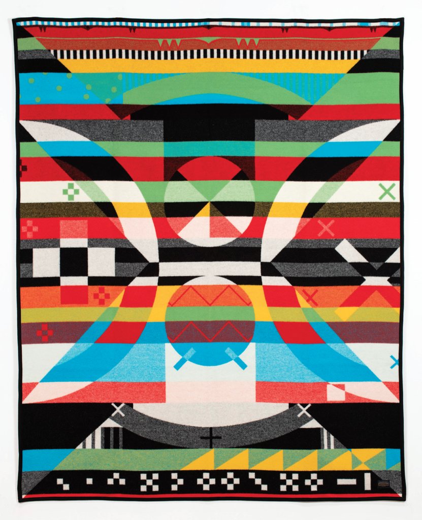
Often when talking about the residential school system, there is a risk of re-traumatizing Survivors of these institutions, and the communities that are still suffering the effects of generational trauma. I looked for a way to bring a greater context, as per the bank note format, but also to balance with lightness or triumph. I chose to include a piece by Indigenous artist Jordan Bennett, as his work is inspired by Mi’kmaq and Beothuk iconography such as petroglyphs, basket weaving and quillwork.
The Jordan Bennett Collection Pendleton Blanket.
Petroglyphs, carvings and paintings found across Canada and are often more than 1,000 years old. I liked the way it acknowledges the oldest representations of culture in Canada, through a current artist, and speaks to the resilience of indigenous culture, that the Survivors flag also represents.
The selected piece from Bennett was designed to be applied to a Pendleton blanket as an official collaboration and act of reclamation. Wool blankets such as these were one of the first forms of currency between settlers and Indigenous people, being used since 1670, and have a long and complex history. The Points of the Hudson’s Bay blanket accurately denoted its value.
I like the way that Bennett’s piece speaks to the meaning of currency under modern capitalism, what it used to be, and perhaps what it could be in the future.
Here is a bit about Bennett’s work: https://canadianart.ca/sponsored/the-jordan-bennett-collection-honouring-tradition-celebrating-the-contemporary/
Petroglyphs: https://www.thecanadianencyclopedia.ca/en/article/pictographs-and-petroglyphs
Point blankets: https://www.thecanadianencyclopedia.ca/en/article/hudson-s-bay-point-blanket
Unsettling Settler Possession: https://visualartsnews.ca/2020/10/unsettling-settler-possession/
My re-designed of the $20 Canadian bill, which is used as the vehicle to present the Survivors Flag, and Jordan Bennett’s work.
Kim McNeil’s re-designed Canadian passport, and national stamp.
Brief Three Reflections
With this final brief, I found I often thought of what my role and voice is a designer. I have the power to inform and shape the output of design pieces but when should I lay off the accelerator and take the back seat, or the bus.
I think an ego-check is warranted depending on the piece of work and what the end goal or vision is. With week 12’s output, a designer should be glad not to put their name onto that piece at all, and instead be proud to have leveraged a platform for others.
What does my voice bring, and how should I use it.
I also found myself inspired by looking to the past. When researching the Beat Generation movement, it opened up so many other avenues to explore. The underground press, DIY sharing of information and art, how artists communicated.
Being informed is crucial to output meaningful work, and information can spark so many more ideas.
I think it’s also important not to reinvent the wheel. Theres always something from the past, or present, that we can draw from.
Lectures and Readings
In Sam Winston’s talk he said something that really interested me, as it’s something I ponder quite often.
The future of design is inherently tied to the attention of the economy, and is inherently tied to technology.
I think the way we consume social media, articles, news, video has altered our attention spans and is caught in a bit of a viscous cycle. META noticed we weren’t completing the view on 30 second videos, so it changed the format to 15 second stories. Then we started skipping through the stories after a few seconds. So now snippits of video only 1 second long are being mashed up it to “mini VLOGs'“ on Instagram Reels.
I wonder to what end point, or to what will give first.
Personally, I think there’s been too much change, too quickly, and too much is informed by what makes advertisers money.
I hope that the future of design looks through an anti-capitalist lens, and so we can stop feeding the beast that it quite literally altering our brains.
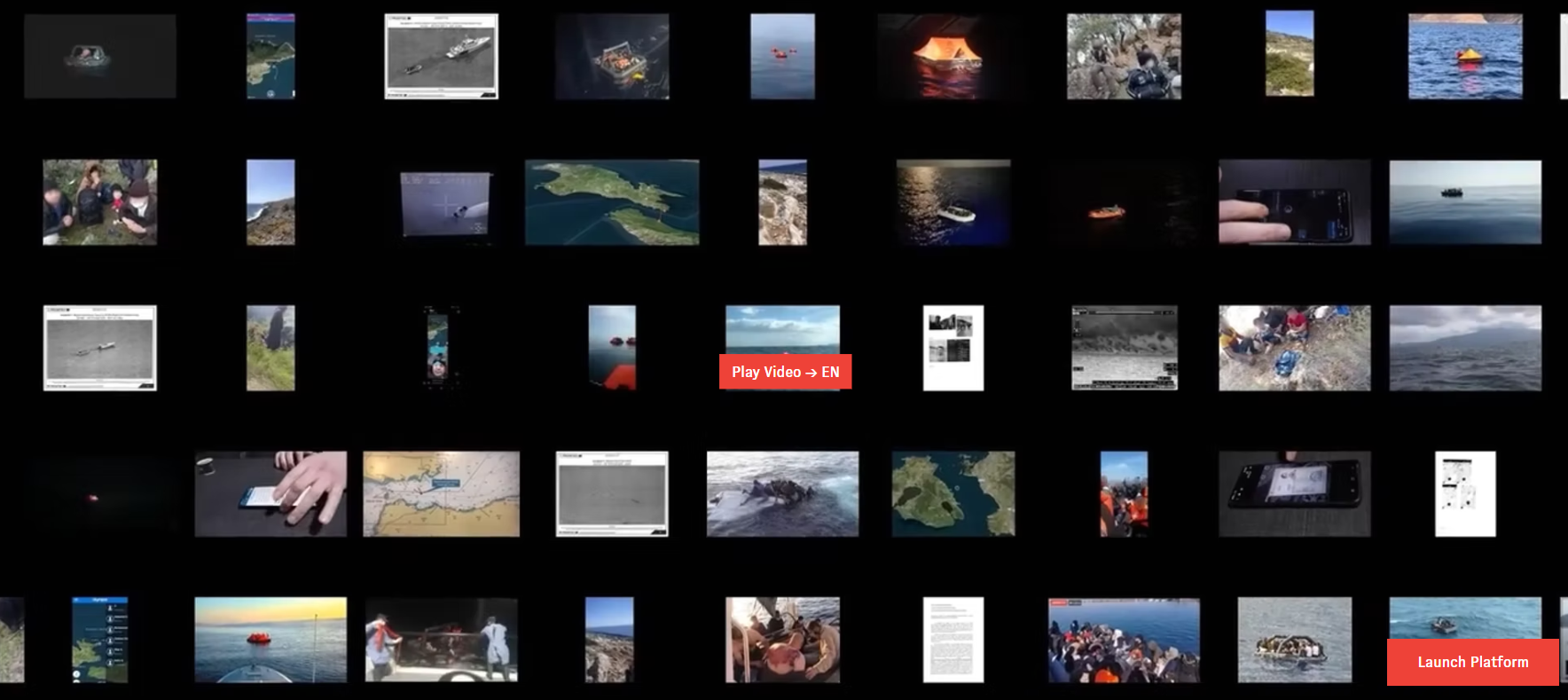
Forensic Architecture
To see an examination of this depth is quite incredible. There’s so much to absorb. Especially with it being a non-linear, you can take so many different paths when exploring this data.
I was surprised that each case was so in-depth and multi-layered, with timelines, high quality video production, animation, mapping, topography. So much has been considered it almost feels impossible.


