

Final output
I was drawn to explore a poem from the central, and arguably the most prolific poet of the Beat Generation — Allen Ginsberg. I chose Wichita Vortex Sutra (1966) as I have seen the accompanying music piece performed live, by Beat Generation collaborator, composer and pianist, Philip Glass.
In its live rendition, Glass plays the stunning accompanying piano piece while a recording of Ginsberg’s reading plays powerfully through speaker. You can hear the pacing and emphasis he gives to certain words, pauses, phrases, and sometime words are hurriedly slurred together with powerful intent.
As a designer, it opens up interesting points to consider — how can I convey movement and flow that shepherds the reader through the piece in the way the author intends?

Philip Glass and Allen Ginsberg, Turin, 1992 – photo: Guido Harari
The Beat Poets
An excerpt from The Beat Poets, Poetry Foundation.
In the 1940s and 50s, a new generation of poets rebelled against the conventions of mainstream American life and writing. They became known as the Beat Poets–a name that evokes weariness, down-and-outness, the beat under a piece of music, and beatific spirituality (...)
Beat poets sought to write in an authentic, unfettered style. “First thought, best thought” was how central Beat poet Allen Ginsberg described their method of spontaneous writing.
Available at: https://www.poetryfoundation.org/collections/147552/an-introduction-to-the-beat-poets
When approaching the design, I kept the spirit of the Beat Generation as a guiding principle. Visually, can I make it look spontaneous with layout, type, and colour? They challenged mainstream culture and conventional writing styles — can I challenge the standards of print?
I also looked to how the Beat Poets wrote and distributed their works during this period of social change and experimentation. They took an anti-capitalist approach where the accessibility and sharing of ideas was critical. Wichita Vortex Sutra was first printed, in full, in the Village Voice New York paper.
Incredibly, Wichita Vortex Sutra originated as a voice recording that Ginsberg made with an tape recorder as he traveled across the mid-west. He composed it off the top of his head as he spoke into the device.
“These lines in ‘Wichita’ are arranged according to their organic time-spacing as per the mind’s coming up with the phrases and the mouth pronouncing them. With pauses maybe of a minute or two minutes between each line as I’m formulating it in my mind and the recording ...
I was in the back of a bus, talking to myself, except with a tape recorder. Every time I said something interesting to myself I put it on tape.”
Quote source: https://www.worthpoint.com/worthopedia/1966-free-press-allen-ginsberg-1795090800

The depth of this piece is outstanding. Spontaneous thought, spoken, as the mind thinks, and the mouth speaks. Inspired, in the moment, looking out of a bus window in Kansas. Now, typed as a written piece, carefully arranged to mirror the natural pace and flow of the recording. And finally, accompanied by an original piano composition that flows, builds and relaxes with the spoken words.
Leading | Stress | Pace | Colour | Mark Making | Flow | Font | Era
I imagined Ginsberg’s workspace as a too-small desk, with an uncomfortable chair. He sits hunched over a clunky typewriter, over-caffeinated, furiously hitting the keys as his mind bubbles over with anger at the US government, apathy, war, poverty and classism. All the papers on his desk have coffee rings, cigarette ash, and scribblings. Some of the words are typed over, perhaps a mistake, or intentionally for emphasis.
Although the poem can be soft and tender, his voice soothing and Glass’s playing heartfelt — the change Ginsberg called for was bold. He dared to address capitalism as a disease, and war as a cancer. This poem is a call to action, a wail, a cry for others to join him — to join his resistance.
The leading helps organize the reader through the work, showing them which thoughts continue forward quickly, and when your mind can take a brief rest.
As the full poem is many pages, I chose a natural ending point for the excerpt in my visual expression. In the future, I would love to explore how I could put together the full poem into a book, and what that could look like through the lens and guidance of the Beat Generation.

I also pulled inspiration from underground press in the 60’s.
https://www.theguardian.com/media/gallery/2017/sep/23/covering-the-counterculture-the-60s-underground-press-in-pictures
I don’t think the audience knows how to take Ginsberg’s sincerity…
Lecture and Readings
Type, it’s history, fonts, and the different applications is a bit of a blind spot for me. My education in fine arts and printmaking, always steered me into the art print side of print production.
This week’s lecture helped fill in some of the gaps in my knowledge, not just in type, but of the analog days of design, and more context to pull from in my graphic design practice
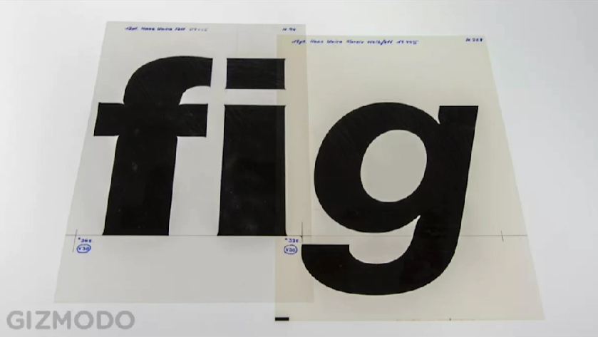
While I have taste and eye for how type works in a composition, and an aesthetic point of view, I took this week as a chance to dig further into the history of published media, particularly alongside my research on the Beat Generation.
It’s interesting to me, how art and socio-political movements had an aesthetic, often informed by the production means they had access.
Excerpts from readings:


Cooper Black is an iconic font, and a favourite of mine (not that I get to use it much). This video was a fascinating look at production, industry, and the practicality of how this font came to be a staple:
I also looked further into accessibility, classism, and anti-queerness in fonts, but I think I could dedicate an entire semester’s research into those themes. Another video that helped inform me on the applications and versatility of font design was Times New Roman, below: